You are using an out of date browser. It may not display this or other websites correctly.
You should upgrade or use an alternative browser.
You should upgrade or use an alternative browser.
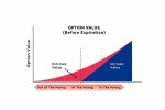
What type of chart is this?
- Thread starter DashboardNovice
- Start date
DashboardNovice
Did You solve it Yourself?Adding vertical gridlines to a pivot chart
Is it possible to add vertical grid lines to a pivot chart at each price on the X-axis?
chandoo.org
pecoflyer
Well-Known Member
IndeedThis looks similar to an area chart but not quite
DashboardNovice
Member
DashboardNovice
Did You solve it Yourself?
Adding vertical gridlines to a pivot chart
Is it possible to add vertical grid lines to a pivot chart at each price on the X-axis?chandoo.org
I'm trying to replicate the screenshot I posted above. It looks close, but still a bit off.
GraH - Guido
Well-Known Member
DashboardNovice
Like @vletm asked you in the other thread, you might upload a sample dataset and your chart trial?Makes our lives a bit easier in helping you.
Easiest way it to select the chart, insert a line shape at the position you need it.
But that's not "dynamic", and I assume that's what you'd need.

pecoflyer
Well-Known Member
Lots of charts at https://andypope.info/charts.htm
and
 peltiertech.com
and
Peltier Tech Excel Charts and Programming Blog - Peltier Tech
The Peltier Tech Blog contains hundreds of articles and tutorials about Excel Charting and VBA, formatting, data preparation, and reporting.
peltiertech.com
Peter Bartholomew
Well-Known Member
It is possible to replicate the appearance of the chart using and area chart in combination with error bars on a scatter chart and text boxes but that is not to say that the original chart was created using Excel. It is more of an infographic than a quantative chart.

I used an exponential curve for the Extrinsic value though whether there is a theoretical basis for that I have no idea.
I used an exponential curve for the Extrinsic value though whether there is a theoretical basis for that I have no idea.