• Hi All

    Please note that at the Chandoo.org Forums there is Zero Tolerance to Spam

    Post Spam and you Will Be Deleted as a User

    Hui...

  • When starting a new post, to receive a quicker and more targeted answer, Please include a sample file in the initial post.

Need help in making 3D Pie-Chart

dvm49

Member
Hello,

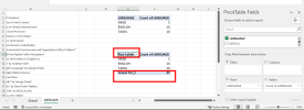
I have some data like "Articles" sheet in the attached Excel Sheet. I would like to create a Pie Chart so that it contains the information of Each Language has how many articles. Can someone suggest on how to make this? Thanks

Note: I would like to make the Pie-Chart available in Sheet1.
 

Attachments

  • PIE_CHART.xlsx
    10.5 KB · Views: 4
I can siggest steps as unable view your file.

To create a pie chart in Excel based on the data you provided, you can follow these steps:

1. Open your Excel file and go to "Sheet1" where you want the pie chart to appear.
2. Select the cells containing the language and article data.
3. Go to the "Insert" tab in the Excel ribbon.
4. Click on "Pie Chart" in the Charts group.
5. Choose the type of pie chart you prefer. For this data, a 2-D pie chart should work well.
6. Excel will automatically create a pie chart based on the data you selected. By default, it might not be exactly how you want it, so you might need to make some adjustments.
7. You can customize the chart by adding titles, adjusting the colors, and modifying the legend as needed.

Excel will automatically count the occurrences of each language and create the pie chart accordingly.
 
Add a pivot table and chart, move the chart to Sheet1. See attached.
 

Attachments

  • Chandoo56375PIE_CHART.xlsx
    22.3 KB · Views: 7
@p45cal, I have tried the same Pivot Chart Myself with the same data.. But for me, Instead of LANGUAGE, I get Row Labels and also the Grand Total is appearing.. What am I missing? Why the header name is changing to Row labels and how can I disable Grand Total Detail?
 

Attachments

  • pivot.png
    pivot.png
    74.6 KB · Views: 4
Back
Top