• Hi All

    Please note that at the Chandoo.org Forums there is Zero Tolerance to Spam

    Post Spam and you Will Be Deleted as a User

    Hui...

  • When starting a new post, to receive a quicker and more targeted answer, Please include a sample file in the initial post.

Dual axis using line graph issue

amitnewbee123

New Member
Hi experts,

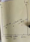
I need to show the attached data as a dual axis line graph as shown in result.jpg.

Here x axis should have the categories like Extremely fine, extra fine, fine under Netz column and Y should have the K column values and another Y axis with L6 column values. so basically i want dual axis for my given data in All Graphs.xlsx. But i dont know how to proceed, could you please demonstrate me as an example for the given test values.


Kind regards

Amit
 

Attachments

amitnewbee123

Or ... something like this based Your picture?
Hi , The visualization you created gets distorted when I expanded it, may be because the data i attached was not sufficient.

I added some more data:I want to show them all together in 1 graph. Attached is the new data excel sheet

What is the best possible respresentation you can think of? If K,L and (Extremely fine, Finer,fine categories) cant be shown in 1 graph then we can think about multiple graphs .

I want to use line graph mostly ,bar charts(if the former is not possible).
 

Attachments

amitnewbee123

It works with those settings,
but if You've changed something
... then You've gotten as You've changed.

My opinion is that You should verify those three red values which I marked.
... numbers are numbers and seems that all data-values should be negative.
I added there slicer for selecting wanted L4's.
There are some challenges with L4 700...900 - so close values.
... even those are in right side axel.
... I tested those with own chart - almost same result.

(( There could be more possibilities, but then input should be under control. ))
 

Attachments

Back
Top