Anna Conda
New Member
Hi,
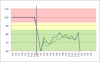
I do have to maintain a pretty big spreadsheet with approx 200 charts. The charts are simple line or bar charts. In addition green/yellow/red boxes indicate ok/not ok areas for the data values. Those boxes are done at the moment with graphic shapes. As well a vertical line is indicating the current period of time (done just by a graphical line).
Every month/period I have to adjust the time for the period as well as taking care of changing requirements for the colored boxes, which takes a lot of time and is the source of many errors.
I was playing with the charts to see if all 3 information could be automated: (1) line/bar charts showing the periodical data, (2) swim lanes indicating the good/bad areas and (3) an indicator for the current period. With the use of the secondary axis I can do either #2 or #3 but not both :-(
Challenge to the audience: is there a way to fully automate such a chart without manual intervention, just by adjusting the numbers?
I would very much apprechiate any suggestions!
PS: I wanted to upload a picture of the chart, but it says "an error occured". Will try again a bit later
")