DashboardNovice
Member
On the yellow tab, I have a data series called 15-min displayed (R75 is checked) on the 2nd graph. I am trying to get a continuous line to connect all data points. When Excel encounters a blank in column R, it appears to graph that as a zero.
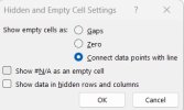
I'm sure the answer is in the window below, but I can't figure out which combinations should be selected.

Also, on the 2nd graph, the 30 minute chart and possibly others appear to display on the zero line. How can I get it to not show any color plotted at zero since I'm not plotting anything for those data series anyway (the boxes on row 75 are not selected for those data series).
I'm sure the answer is in the window below, but I can't figure out which combinations should be selected.

Also, on the 2nd graph, the 30 minute chart and possibly others appear to display on the zero line. How can I get it to not show any color plotted at zero since I'm not plotting anything for those data series anyway (the boxes on row 75 are not selected for those data series).
